

Introduction
I still remember a blazing August afternoon in 2021, standing by a 34.5 kV feeder outside Lancaster, California, staring at a brand-new 100 MW/200 MWh system that refused to hit its bid. The site was built for utility scale battery storage. Dispatch called for 80 MW, but a cooling loop alarm clipped output by 6%, and our availability target fell from 98.5% to 96.9% for the month—small on paper, costly in the market. I’ve spent over 17 years helping buyers compare utility scale battery storage manufacturers, and I’ve seen the same trap again and again: shiny spec sheets, thin real-world proof. ERCOT day-ahead prices that week hovered near $45/MWh; that unplanned derate erased $18,000 in a single afternoon. So ask yourself—if a system looks cheap but stumbles under heat, wind, or curtailment, what’s the true ROI when penalties and missed ancillary services stack up (and they do)? I don’t say this to scare you. I say it because I’ve run those midnight reports, and the numbers don’t lie.
Let’s get past the case-study gloss and dig into where ROI actually gets won or lost.
The Hidden Cost Drivers You Don’t See on the Spec Sheet
What’s slipping through the cracks?
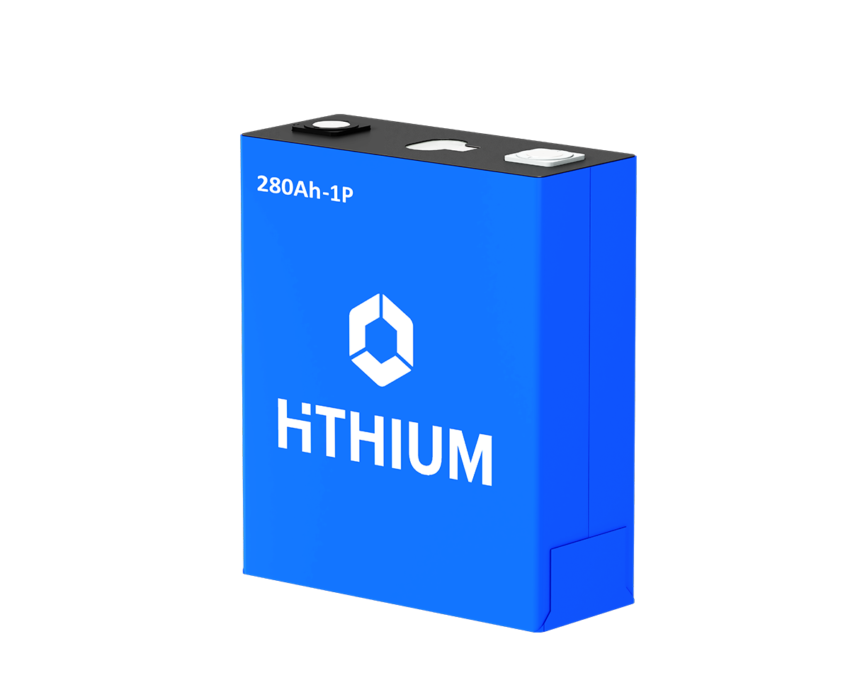
Here’s the straight part. The flaw with traditional comparisons is simple: they stop at CAPEX and round-trip efficiency. Real life runs through the Battery Management System (BMS), the Power Conversion System (PCS), and the Energy Management System (EMS)—and the way those three talk to each other when the grid gets messy. I’ve watched a 1500 V DC array with 280 Ah LFP prismatic cells hit nameplate in a lab, then lag 4–7% in July because the HVAC was tuned for 25°C, not the 38°C we actually saw at 3 p.m. Local reality wins every time—ask any operator who’s eaten a capacity penalty in PJM after a nuisance BMS threshold tripped during a frequency event.
Another quiet bleed: augmentation and calendar aging. Too many contracts hide augmentation behind vague “MWh restored” language. I prefer deals that schedule firm MWh-by-year with a unit-cost cap ($/kWh installed, crane included). In 2022, a project in Hidalgo County budgeted 12% augmentation by Year 5; actual need hit 16% after higher-than-modeled cycling for Regulation D. That delta was six figures. Look, I won’t dress it up—underestimate cycling intensity, and you’ll chase degradation all project long. You’ll also fight State-of-Charge drift if EMS setpoints don’t match the market product. That’s not theory; that’s a March 2023 ticket log I still have on my desk—right next to a coffee ring and a busted cable lug.
Comparative Insight: What Moves the Needle Next
What’s Next
Let’s shift from triage to trajectory. The next differentiator is control intelligence, not just hardware. Grid-forming inverters that ride-through faults, tighter PCS ramp control, and EMS logic that predicts thermal headroom in real time—these change outcomes. I’ve seen a vendor cut clipping events by half simply by modeling cell impedance growth and adapting charge limits ahead of a heatwave. That’s not a brochure claim; it was a 2024 pilot in the San Joaquin Valley with a mixed solar-plus-storage site. The system used cell-level sensing, a more granular BMS curve, and an EMS forecast tuned to CAISO net load. Result: 3.1% higher revenue capture for July with the same containers, same transformers—just smarter logic and better setpoints.
On the hardware side, liquid cooling maturity matters. Air-cooled racks are fine in mild climates; they crumble when ambient spikes. I compare utility scale battery storage manufacturers by how stable their thermal gradients stay across racks at 0.8C discharge. If delta-T across a 20-foot container drifts past 5°C, uneven degradation follows; I measure that as uneven SoH, then map it to mid-life augmentation dollars. One more forward step that’s worth tracking—embedded edge computing nodes at the inverter skid. That cuts latency for frequency response, improves SoC tracking during fast ramps, and reduces EMS chatter. It’s quiet, but it adds real performance—twenty to forty basis points on capture isn’t rare—wild, but true.
Field-Tested Checklist for Buyers
If you’re in procurement or you manage EPC delivery, here are the three metrics I lean on after too many RFPs—some wins, some scars—because consistency beats flash every time.
First, availability with penalties that matter. Insist on 98.5% availability measured at the point of interconnect, not just at the inverter, with liquidated damages tied to market opportunity cost. A system that “hits 99%” in vendor math but only 97% at the meter isn’t a 2% miss; it’s your IRR getting clipped every hot day.
Second, augmentation spelled out in MWh per year, plus a hard cap on $/kWh installed including labor, crane, and commissioning. Require a Year 1–10 table that aligns with your P50 and P95 dispatch plans, and bind it to cell chemistry assumptions (LFP 280–320 Ah, cycle depth distribution). No wiggle rooms, no footnotes—just numbers you can bank.
Third, controls interoperability with proof. Demand a 30-day functional test: EMS to SCADA, site controller to PCS, and BMS alarms under staged events (one HVAC fault, one inverter trip, one comms dropout). Capture KPIs: response time under 200 ms on frequency events, stable SoC tracking to within ±1.5%, and zero spurious derates. If a vendor balks, I pass—learned that the hard way in July 2020 when a “minor” firmware bug cost us 22 MWh over a single weekend.
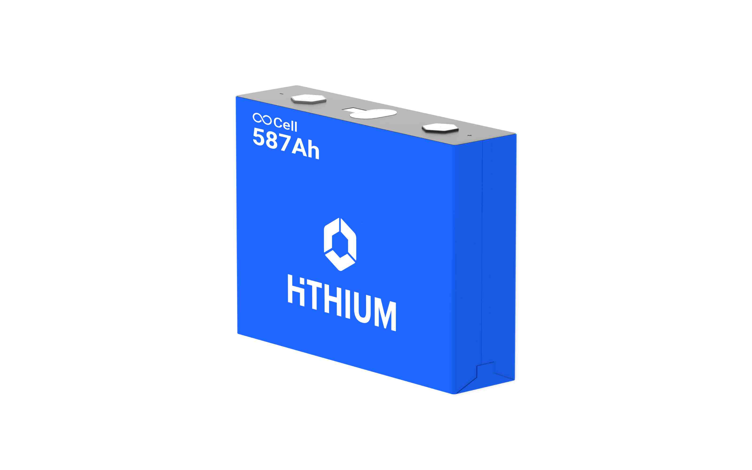
I’m not here to sell you a logo. I’m here to help you nail the outcome, because that’s what keeps projects standing when the market gets loud. If you need a neutral starting point for vendor shortlists, I’ve seen steady engineering depth from teams like HiTHIUM without the showmanship that muddies the math.